
Vila dos Pássaros
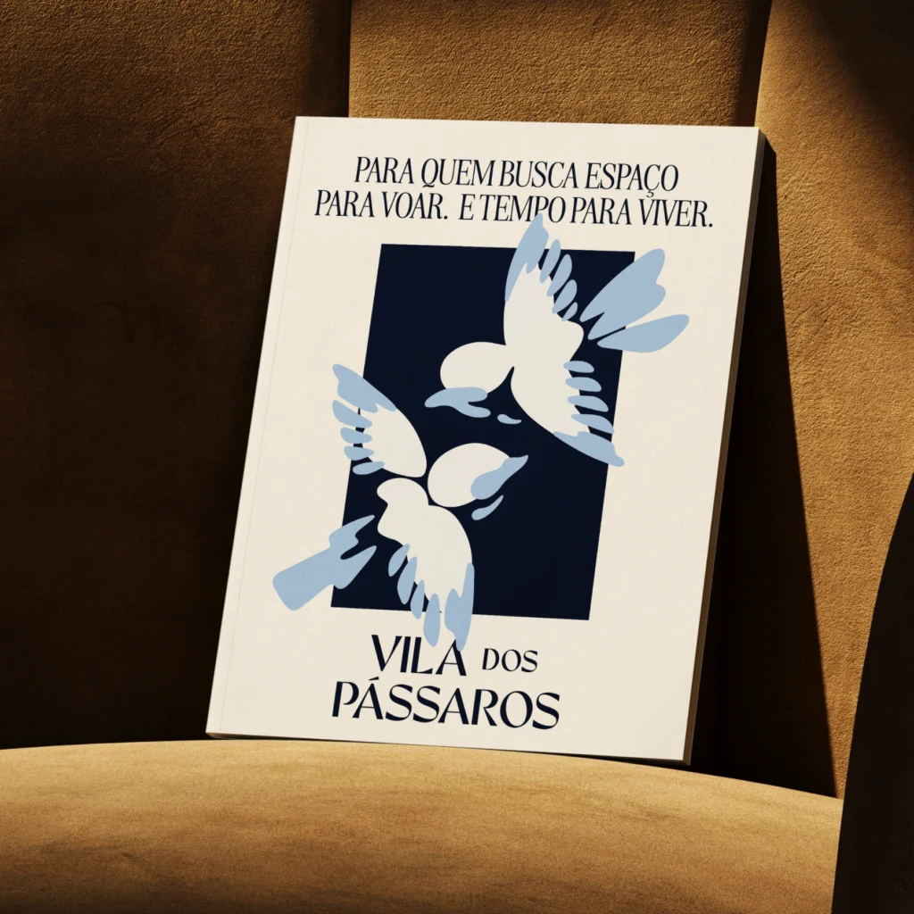
Vila dos Pássaros é um loteamento fechado de alto padrão situado às margens da Lagoa da Precabura, na Região Metropolitana de Fortaleza.
Pensado como um lugar de pausa e contemplação, o projeto nasce do desejo de oferecer uma experiência de moradia mais sensível ao tempo, à paisagem e ao essencial. Um território com vocação para o silêncio, para o pertencimento e para relações mais tranquilas com o entorno.
A identidade do Vila dos Pássaros parte da ideia de um refúgio em harmonia com a natureza, onde arquitetura e paisagem se entrelaçam com leveza e fluidez.
Hola Rio
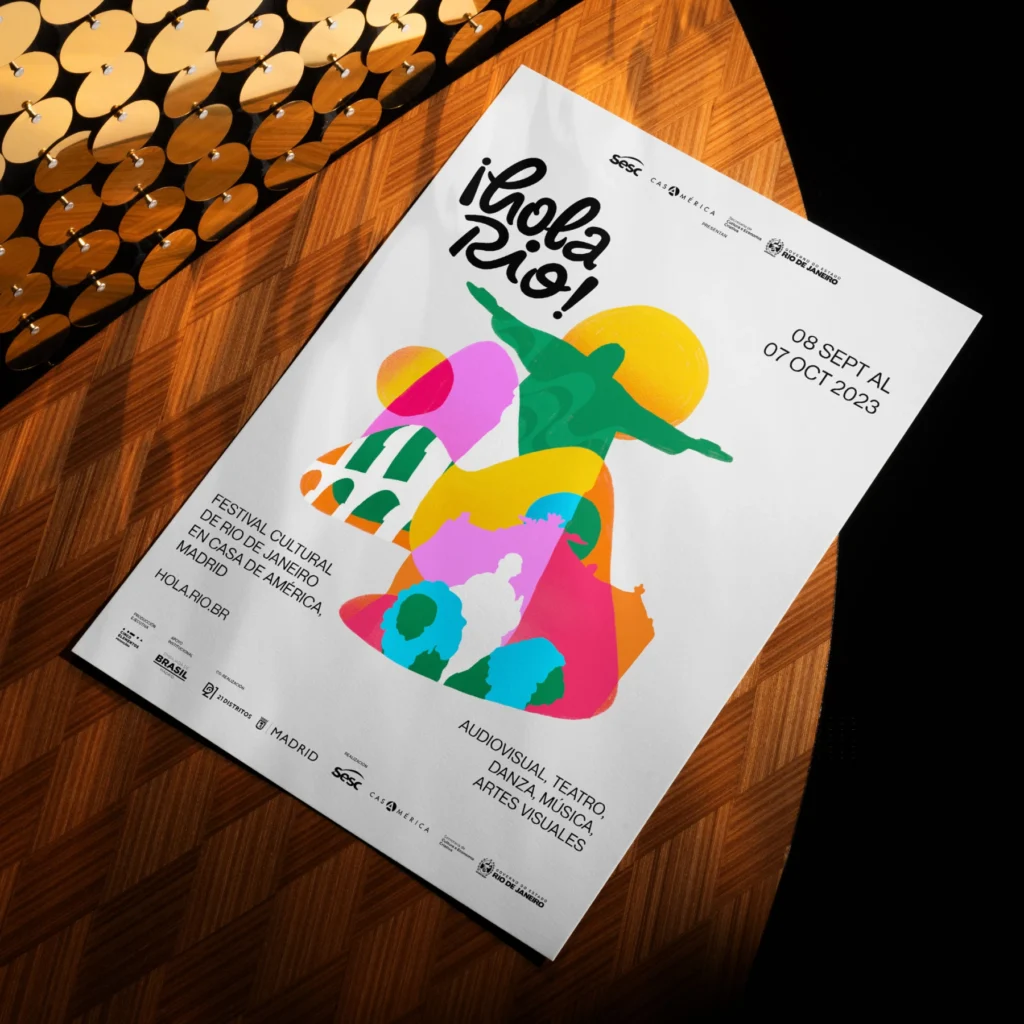
The ¡Hola Rio! Festival is an event that promotes artistic and cultural integration between Brazil and Spain, celebrating the diversity of arts and culture. From September 8th to October 7th, the festival facilitated a rewarding encounter between the state of Rio de Janeiro and the city of Madrid, bringing together Brazilian artists, managers, producers, and technicians in artistic performances, including theater, dance, music, visual arts, and cinema.The challenge was to create a visual identity that represented the artistic union and cultural richness of both nations, conveying the artistic diversity present at the festival. The solution was a vibrant and dynamic visual identity, using bright colors and dynamic shapes to capture the essence of the event and attract interest, resulting in significant participation from artists and industry professionals.
Florar

The visual identity of Florar was created to reflect its mission of providing support and guidance on the medicinal use of cannabis. Inspired by natural elements, the brand uses organic shapes and soft colors to convey warmth, safety, and well-being. The logo, featuring welcoming hands surrounding a nature-inspired symbol, reflects the association’s human and professional approach, emphasizing its commitment to care and support principles. The green and orange color palette, combined with modern and approachable typography, reinforces the message of health, accessibility, and trust.
Festival Elos 2021
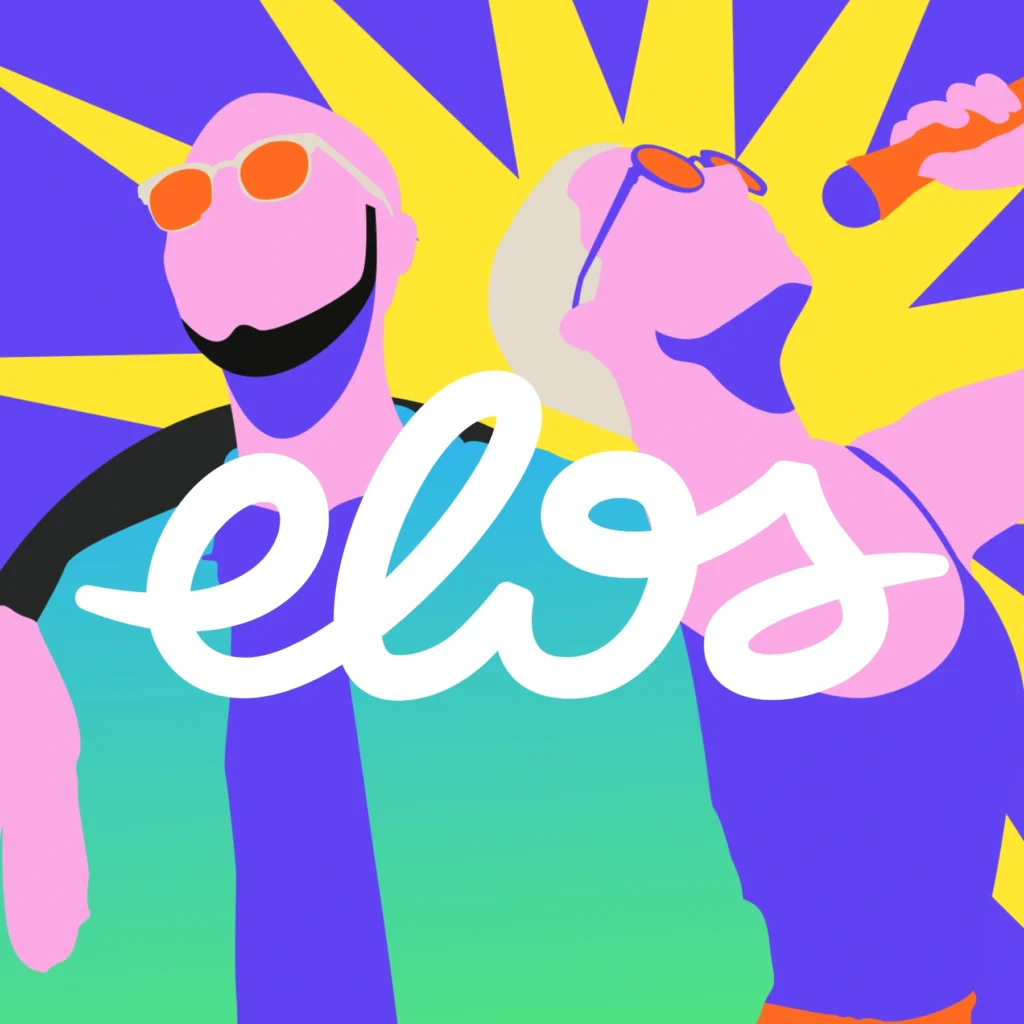
The visual identity of the Elos Festival 2021 was designed to reflect the diversity and vibrant energy of a unique event that blends culture, sports, and social innovation. With a dynamic color palette and graphic elements that evoke movement and connection, the design captures the festival’s inclusive and transformative spirit. The fluid logo and friendly typography reinforce the idea of bonds and unity, while the visual compositions foster a dialogue between art and community. This visual identity is an open invitation for everyone to join this celebration of culture, creativity, and social impact, occupying city spaces with engagement and transformation actions.
BetZilla
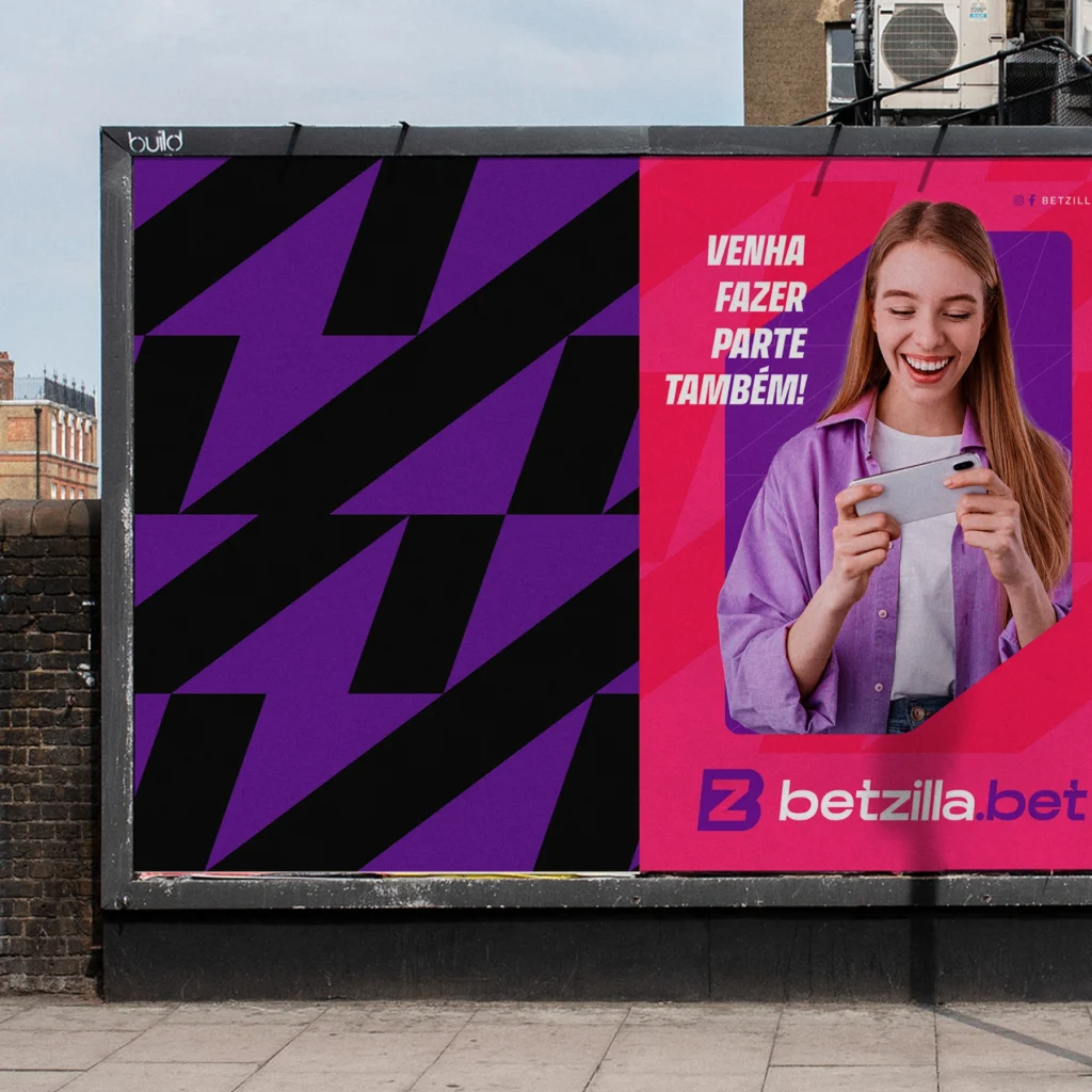
The visual identity of BetZilla was crafted to stand out in the highly competitive sports betting market. Using a vibrant color palette of purple and magenta, the brand conveys sophistication, innovation, and dynamism, aligning with the emotions of its target audience. The modern and bold design, combined with strong typography, reinforces the message of trust, security, and accessibility, reflecting BetZilla’s mission to provide an exciting and secure betting experience for all its users.
Festival Pôr do Som
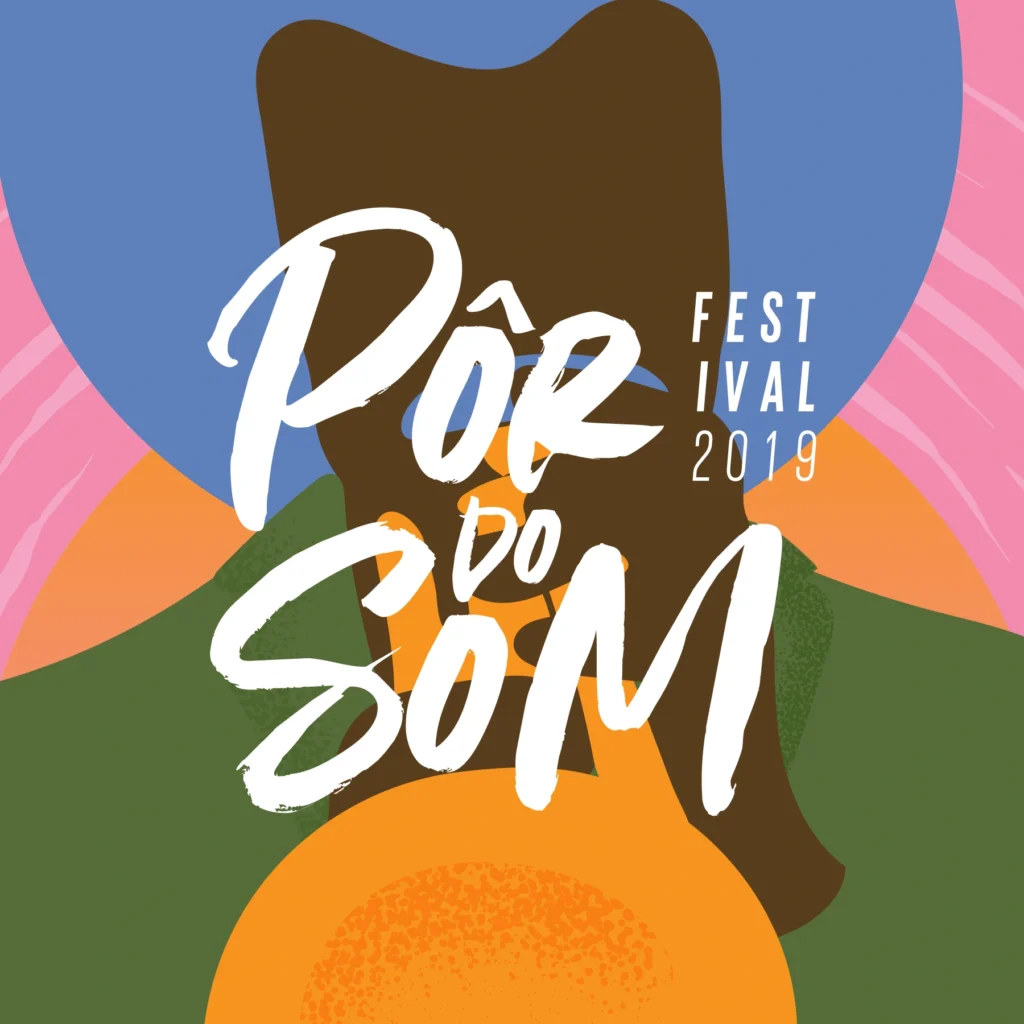
The visual identity of the Pôr do Som Festival stands out for its vibrant and modern approach, reflecting the energy and diversity of instrumental music. The bright color palette, combined with stylized illustrations of musicians and instruments, creates a warm and welcoming atmosphere that captures the festival’s spirit. The use of handwritten typography adds a touch of spontaneity and intimacy, directly connecting with the audience. This visual identity not only celebrates music but also reinforces the cultural significance of the event in Ceará’s music scene.
Bodysurf 85
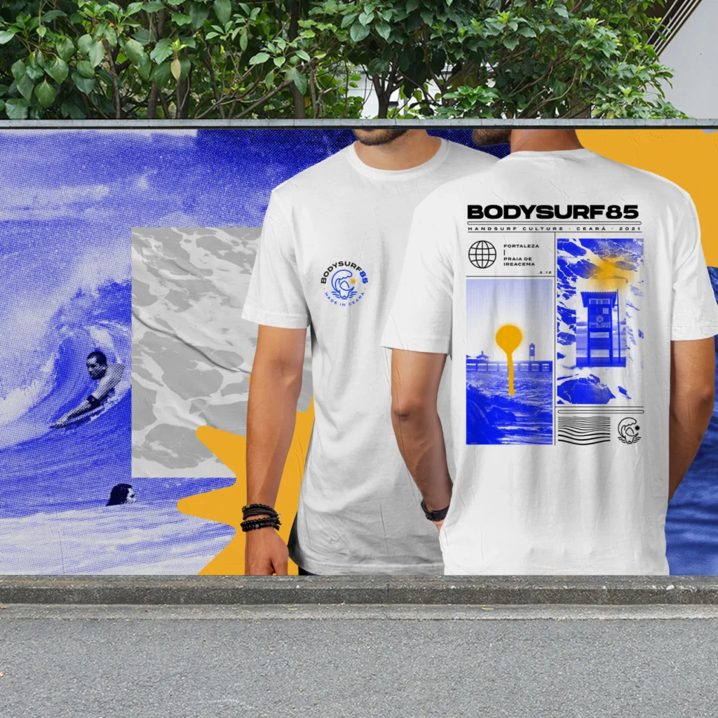
Bodysurf 85 is a clothing brand that promotes the bodysurf culture in Ceará, combining style and purpose. Inspired by the natural elements of the sport — waves, water, sun, and handboard — the visual identity establishes a direct connection to the freedom, health, well-being, and active lifestyle of its practitioners. The logo and communication materials capture the dynamism and essence of bodysurfing, standing out for their contemporary and accessible approach, engaging new enthusiasts, and strengthening the local community.
Lago Montenegro
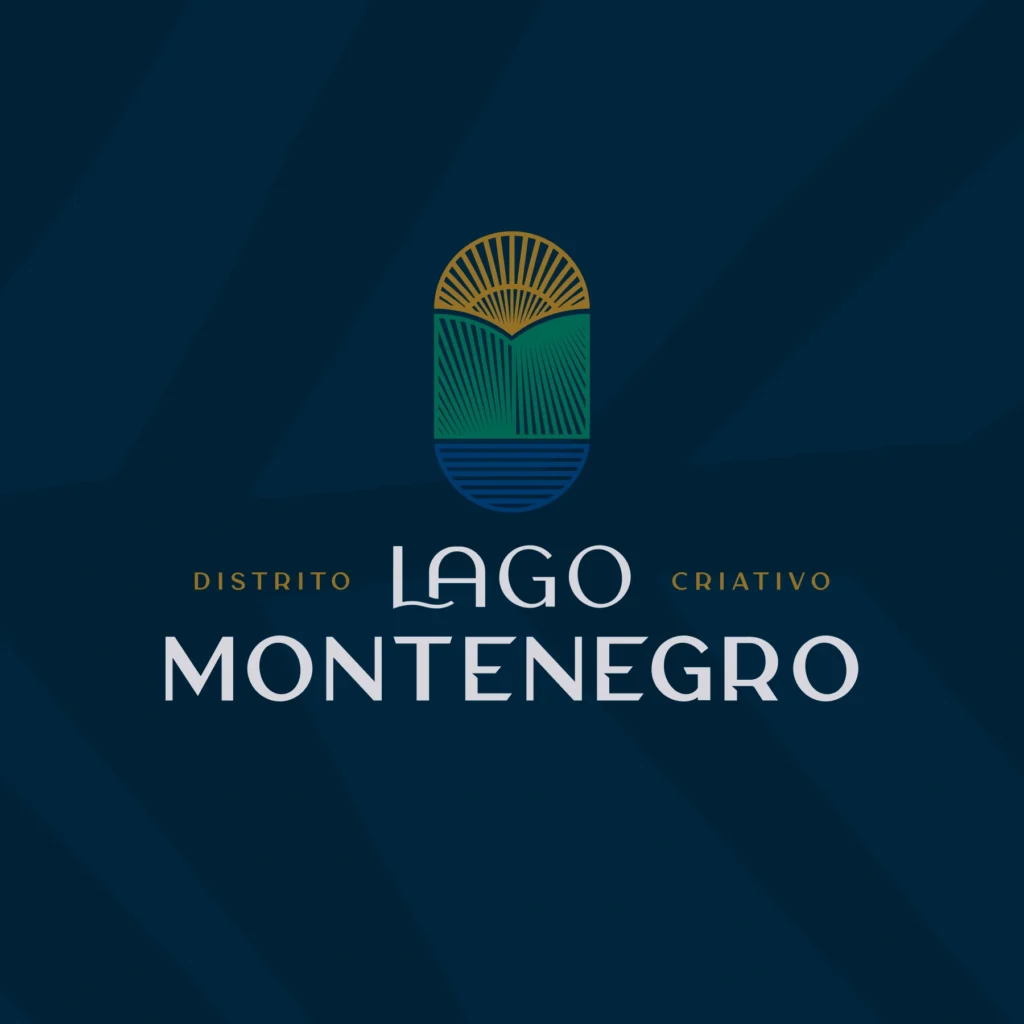
Lago Montenegro is Brazil’s first creative district, combining innovation, sustainability, and quality of life. Located in the José Walter neighborhood of Fortaleza, it fosters community and well-being in a setting that integrates urban design with nature.The visual identity reflects modernity and safety, using a palette of green, blue, and gold that symbolizes sustainability. The logo, with its organic shapes, emphasizes the harmony between the urban environment and nature.
Villa Jeri
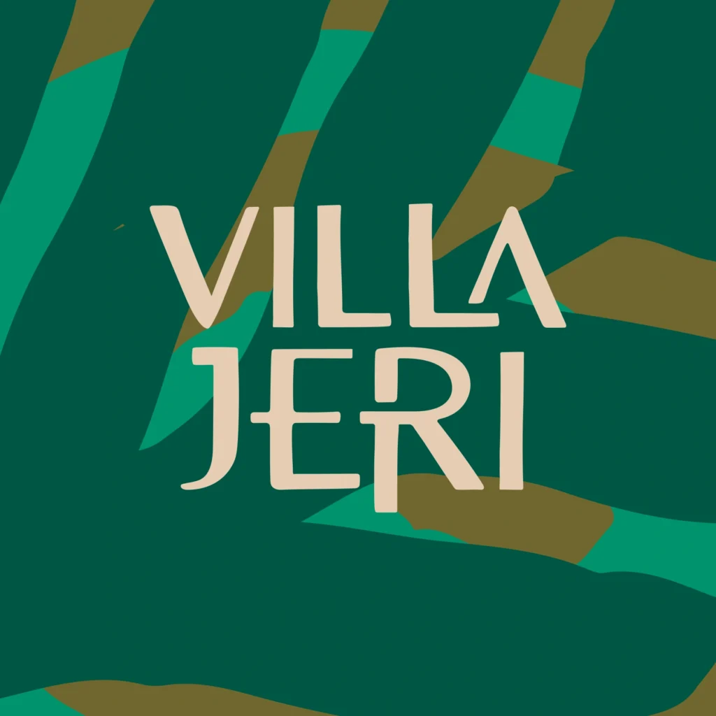
The visual identity of Villa Jeri captures the vibrant and welcoming spirit of the Ceará coast. The brand combines simplicity and energy with a natural color palette — green from the palm trees, blue from the sea, and golden from the sun. Elements like the hammock and palm tree enhance the tropical and authentic appeal, inviting relaxation and connection with nature. The brand communicates sustainability and environmental respect, in line with Montenegro Urbanismo’s values.
Summer Winds
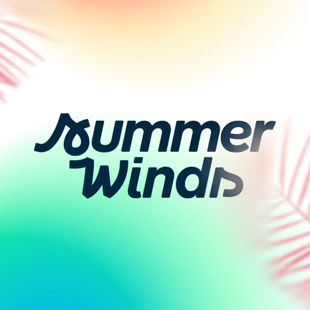
The visual identity project for Summer Winds aims to convey energy, adventure, and relaxation, evoking the feeling of a tropical paradise. With a focus on sustainability, quality of life, and well-being, the brand positions the development as the best investment option on the Ceará coast. The identity reflects the company’s security and credibility, appealing to those looking to build their retreat in a natural and pleasant environment.