
Ótono Filho
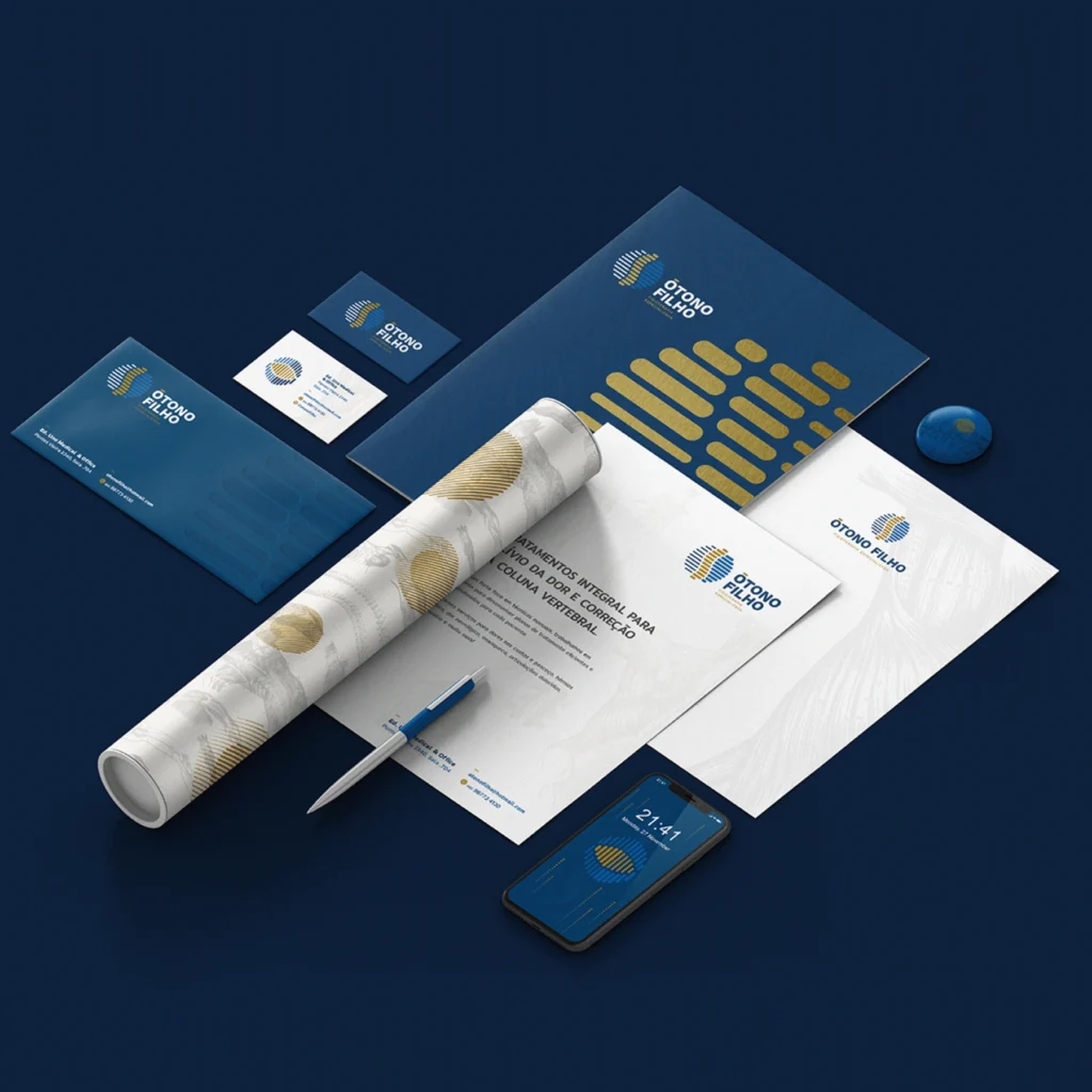
Ótono Filho, a physiotherapist specializing in athlete rehabilitation. Inspired by movement, technology, and the vertebral structure, we developed a design that conveys dynamism and precision. We used a modern color palette and graphic elements that reference anatomy and human movement, reflecting Ótono’s comprehensive and specialized approach to physical treatment and recovery.
Yoginisita

A space that blends art, therapy, and spirituality. Inspired by its holistic essence, we developed a design that conveys serenity and harmony, using soft colors and elegant typography. The graphic elements reflect the concept of mystical alchemy, integrating yoga, meditation, and ceramics in an appealing and cohesive way.
Caterine Catering
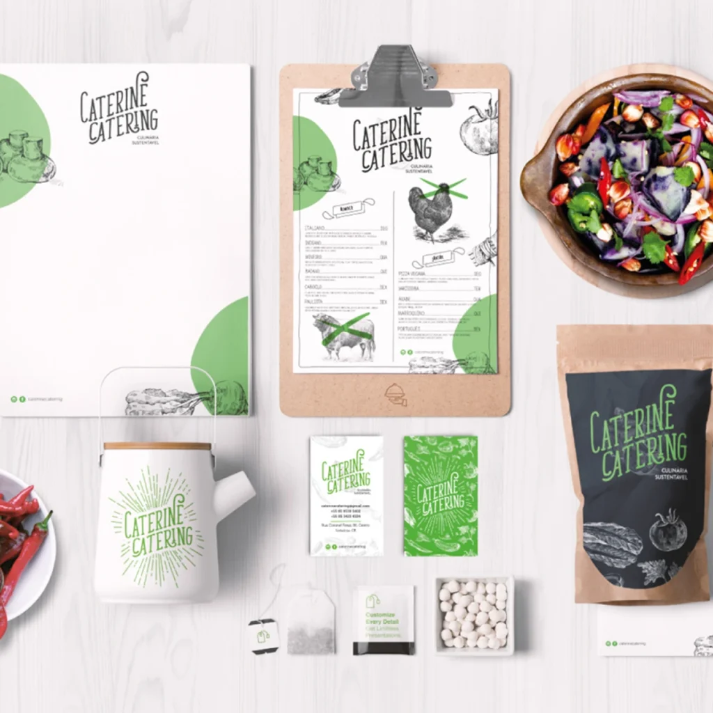
The visual identity of Caterine Catering, a vegan catering company specializing in services for cinema and events, stands out for its unique and fresh approach. The handcrafted and relaxed typography, combined with the conscious use of vibrant colors such as green and brown, conveys a sense of closeness and authenticity — key characteristics of a brand committed to sustainability. Hand-drawn graphic elements, like vegetables and herbs, reinforce the brand’s organic and natural appeal. The design is carefully planned to highlight the company’s sustainable culinary proposition, directly connecting with an audience concerned about the origin and environmental impact of their food. This harmonious combination of elements reflects Caterine Catering’s essence as an innovative and conscious player in the catering market.