
Festival Pôr do Som
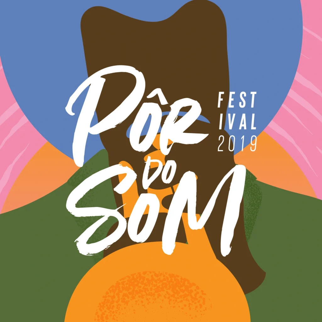
The visual identity of the Pôr do Som Festival stands out for its vibrant and modern approach, reflecting the energy and diversity of instrumental music. The bright color palette, combined with stylized illustrations of musicians and instruments, creates a warm and welcoming atmosphere that captures the festival’s spirit. The use of handwritten typography adds a touch of spontaneity and intimacy, directly connecting with the audience. This visual identity not only celebrates music but also reinforces the cultural significance of the event in Ceará’s music scene.
Bodysurf 85
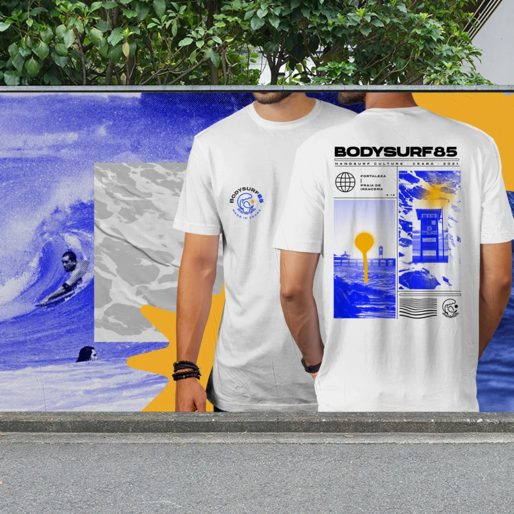
Bodysurf 85 is a clothing brand that promotes the bodysurf culture in Ceará, combining style and purpose. Inspired by the natural elements of the sport — waves, water, sun, and handboard — the visual identity establishes a direct connection to the freedom, health, well-being, and active lifestyle of its practitioners. The logo and communication materials capture the dynamism and essence of bodysurfing, standing out for their contemporary and accessible approach, engaging new enthusiasts, and strengthening the local community
Lago Montenegro
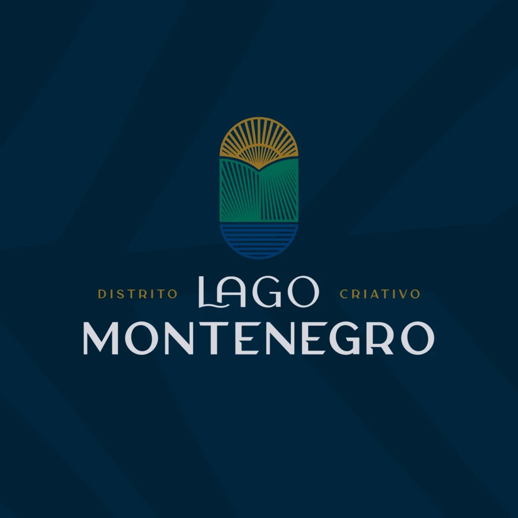
Lago Montenegro is Brazil’s first creative district, combining innovation, sustainability, and quality of life. Located in the José Walter neighborhood of Fortaleza, it fosters community and well-being in a setting that integrates urban design with nature.
The visual identity reflects modernity and safety, using a palette of green, blue, and gold that symbolizes sustainability. The logo, with its organic shapes, emphasizes the harmony between the urban environment and nature
Villa Jeri
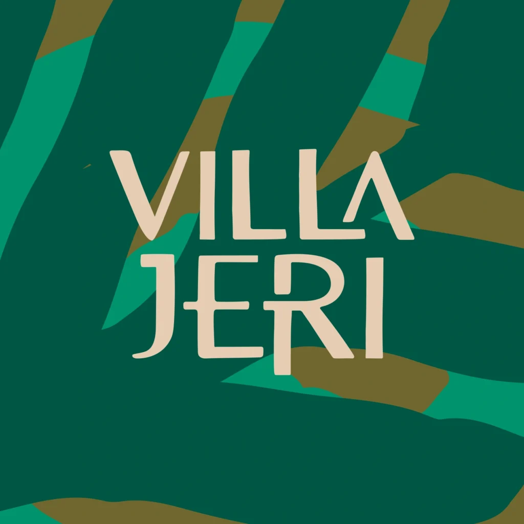
The visual identity of Villa Jeri captures the vibrant and welcoming spirit of the Ceará coast. Inspired by the “Rustic Vibrant” concept, the brand combines simplicity and energy with a natural color palette — green from the palm trees, blue from the sea, and golden from the sun. Elements like the hammock and palm tree enhance the tropical and authentic appeal, inviting relaxation and connection with nature. The brand communicates sustainability and environmental respect, in line with Montenegro Urbanismo’s values.
Summer Winds
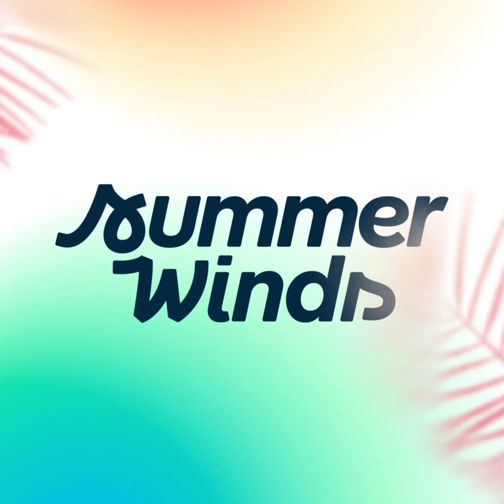
he visual identity project for Summer Winds aims to convey energy, adventure, and relaxation, evoking the feeling of a tropical paradise. With a focus on sustainability, quality of life, and well-being, the brand positions the development as the best investment option on the Ceará coast. The identity reflects the company’s security and credibility, appealing to those looking to build their retreat in a natural and pleasant environment.
Ótono Filho
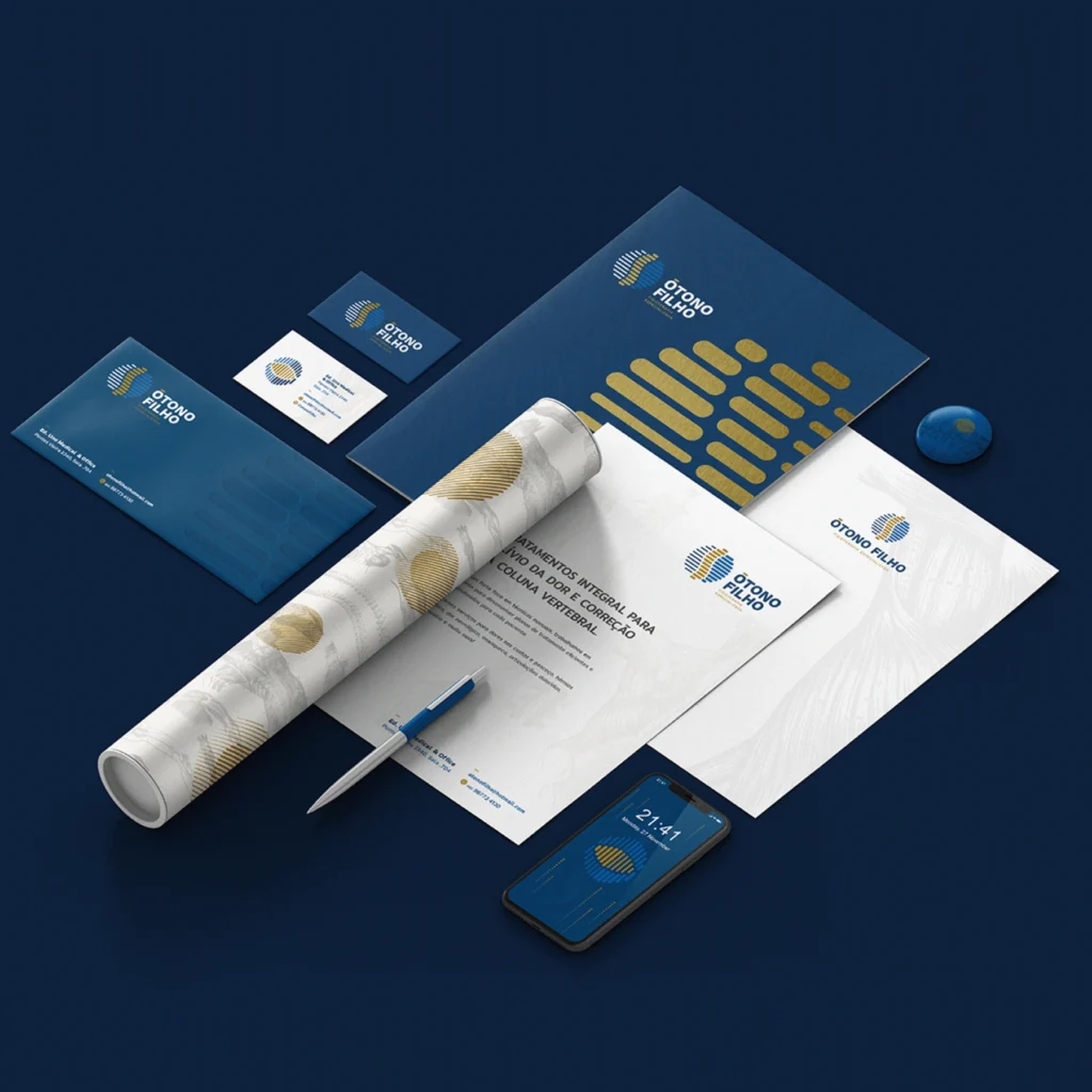
Ótono Filho ı Fisioterapia Visual Identity ENG–Ótono Filho, a physiotherapist specializing in athlete rehabilitation. Inspired by movement, technology, and the vertebral structure, we developed a design that conveys dynamism and precision. We used a modern color palette and graphic elements that reference anatomy and human movement, reflecting Ótono’s comprehensive and specialized approach to physical treatment […]
Yoginisita

Yoginisita Visual Identity ENG – A space that blends art, therapy, and spirituality. Inspired by its holistic essence, we developed a design that conveys serenity and harmony, using soft colors and elegant typography. The graphic elements reflect the concept of mystical alchemy, integrating yoga, meditation, and ceramics in an appealing and cohesive way. PT – […]
Uhuu
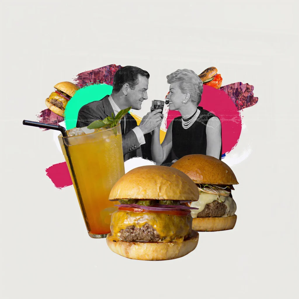
The social media project for UHUU uses a retro collage aesthetic with modern elements and vibrant colors, creating a fun and engaging visual communication that reflects the restaurant’s youthful and laid-back personality.
Caterine Catering
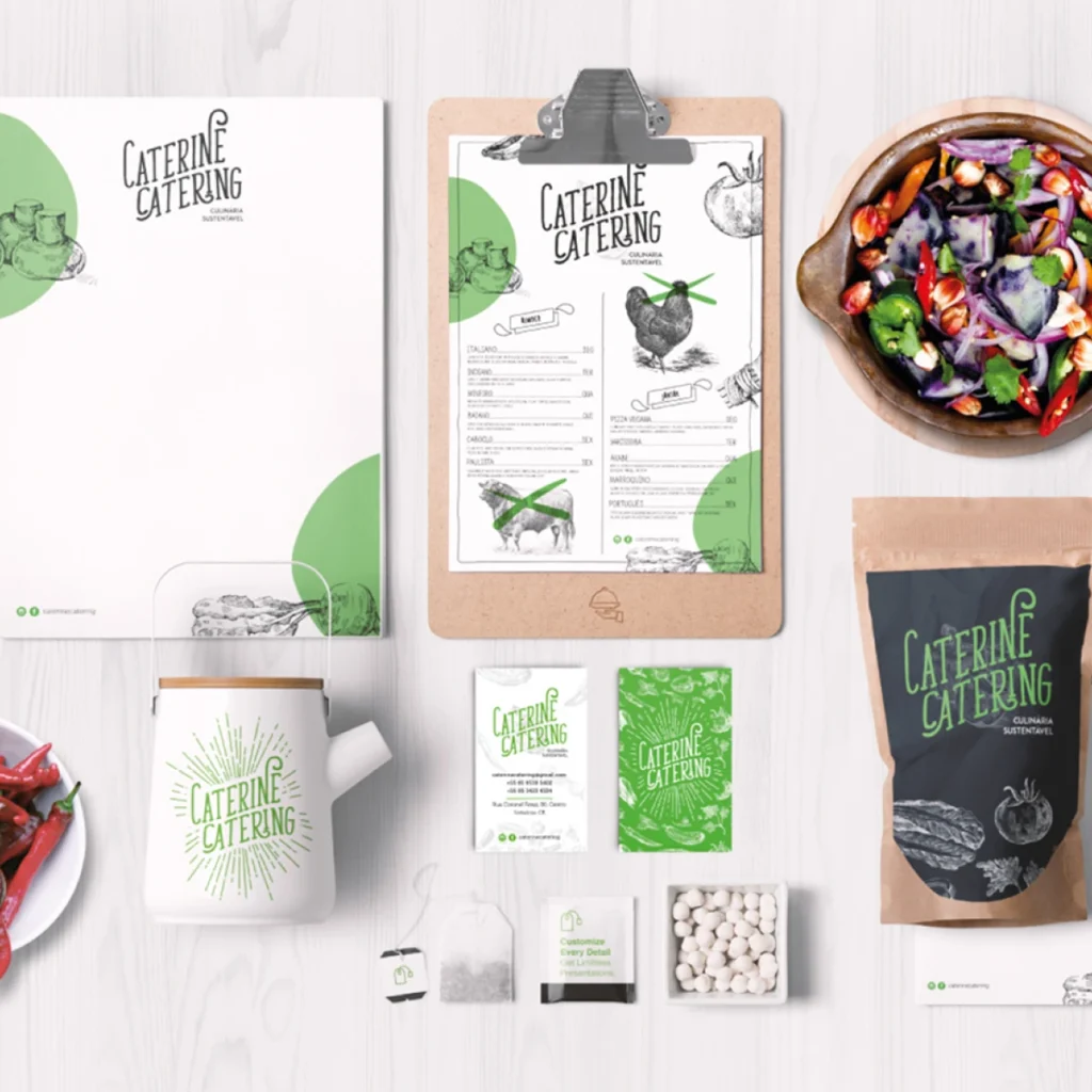
Caterine Catering Visual Identity ENG–The visual identity of Caterine Catering, a vegan catering company specializing in services for cinema and events, stands out for its unique and fresh approach. The handcrafted and relaxed typography, combined with the conscious use of vibrant colors such as green and brown, conveys a sense of closeness and authenticity—key characteristics […]