
Vila dos Pássaros
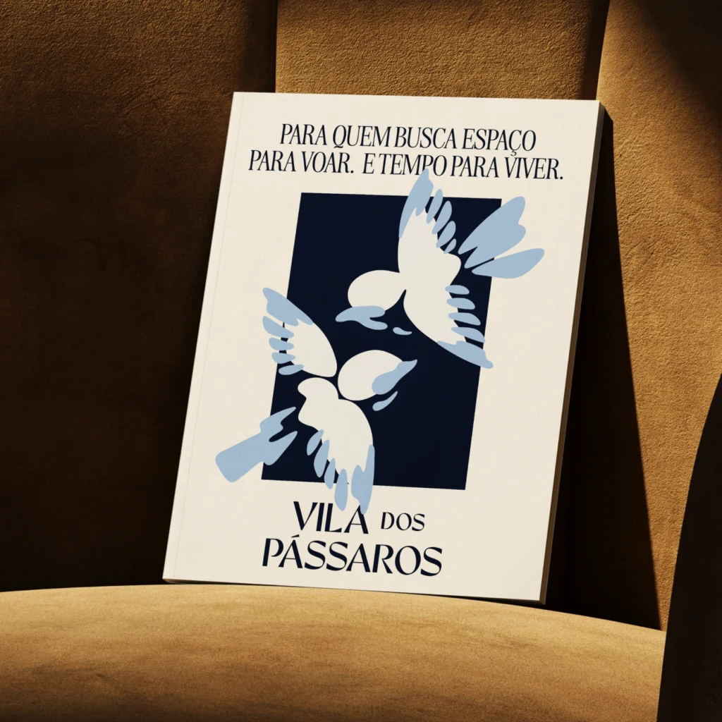
Vila dos Pássaros é um loteamento fechado de alto padrão situado às margens da Lagoa da Precabura, na Região Metropolitana de Fortaleza.
Pensado como um lugar de pausa e contemplação, o projeto nasce do desejo de oferecer uma experiência de moradia mais sensível ao tempo, à paisagem e ao essencial. Um território com vocação para o silêncio, para o pertencimento e para relações mais tranquilas com o entorno.
A identidade do Vila dos Pássaros parte da ideia de um refúgio em harmonia com a natureza, onde arquitetura e paisagem se entrelaçam com leveza e fluidez.
Revela
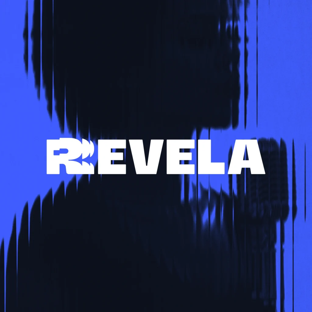
Revela is a cultural platform focused on the development, strengthening, and circulation of independent music. More than a project, Revela operates as an ecosystem that connects creation, education, and visibility, supporting artists at different stages of their careers.
The initiative integrates complementary fronts — such as Revela Lab, focused on training and production — creating a continuous flow between process and artistic growth. The project is based on the understanding that the music scene is built through structure, opportunity, and consistency.
RJ+ Cultura
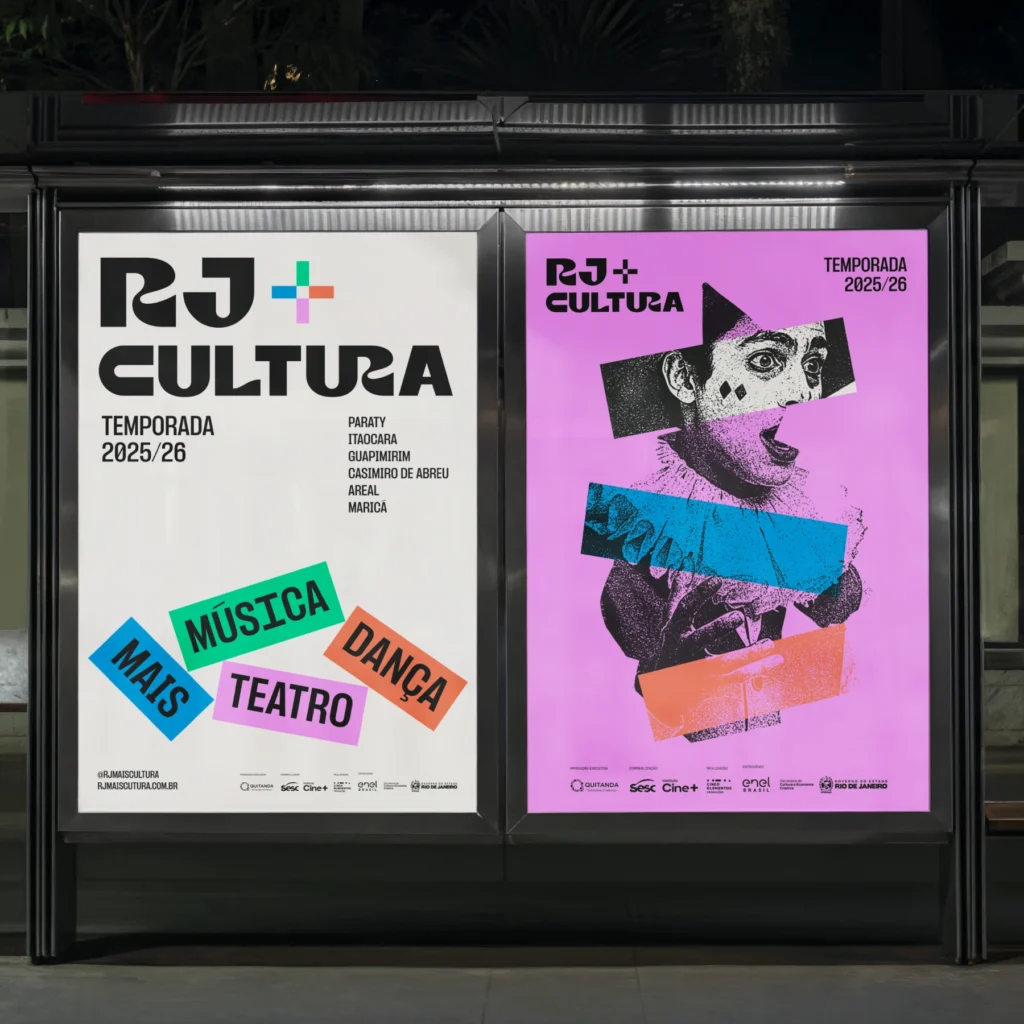
RJ+ Cultura emerges as a response to the need to democratize access to artistic education, connecting six territories in Rio de Janeiro through art as a vector for social transformation: Paraty, Itaocara, Guapimirim, Casimiro de Abreu, Areal, and Maricá in a living network of cultural exchange.
We developed an identity system that celebrates diversity as a creative force, positioning the project at the intersection of cultural preservation and pedagogical innovation.
The brand emerges as a bridge between local traditions and contemporary languages, creating a visual territory that honors regional particularities.
The visual identity is structured around three artistic pillars — dance, theater, and music — each translated into graphic elements that evoke movement, narrative, and rhythm. The system culminates annually in a festival that celebrates collective creations, transforming each territory into a stage for presentations that reveal the cultural power of their communities.
Equitable
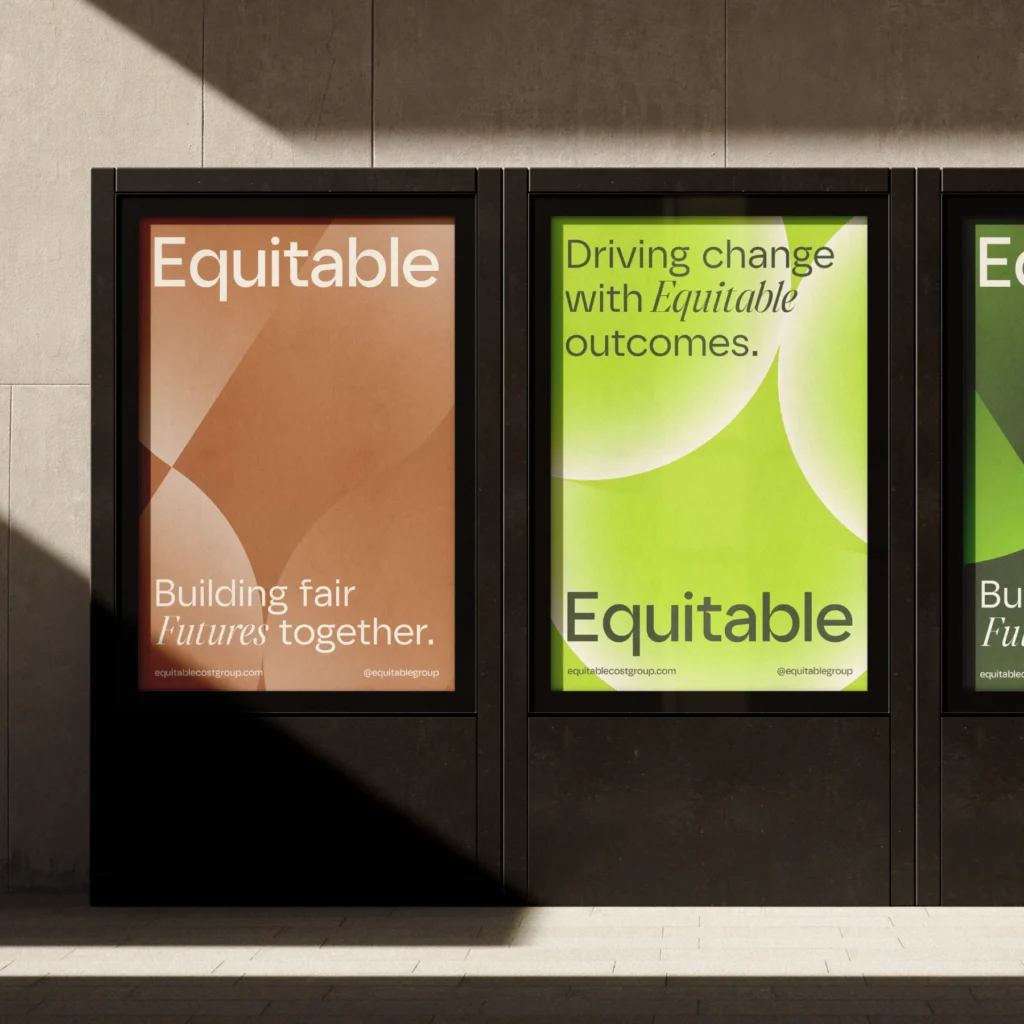
Equitable Cost Group was created to redefine cost management in the real estate and construction sectors. With an innovative business model, the company integrates sustainable practices and an ethical approach at every stage of the process, ensuring that each project not only meets financial expectations but also generates a positive impact on the environment and society. More than just numbers, Equitable Cost Group strives to create real value. Its operations combine technology, expertise, and an unwavering commitment to transparency and equity, setting it apart in a traditionally conservative market. The brand’s visual identity and positioning reflect this essence, conveying solidity, modernity, and an innovative vision for the future of the industry.
This vision has been translated into a strong and coherent identity that clearly communicates the brand’s values and unique approach. A new perspective on cost management—one that is fairer, more sustainable, and more efficient.
Iracema
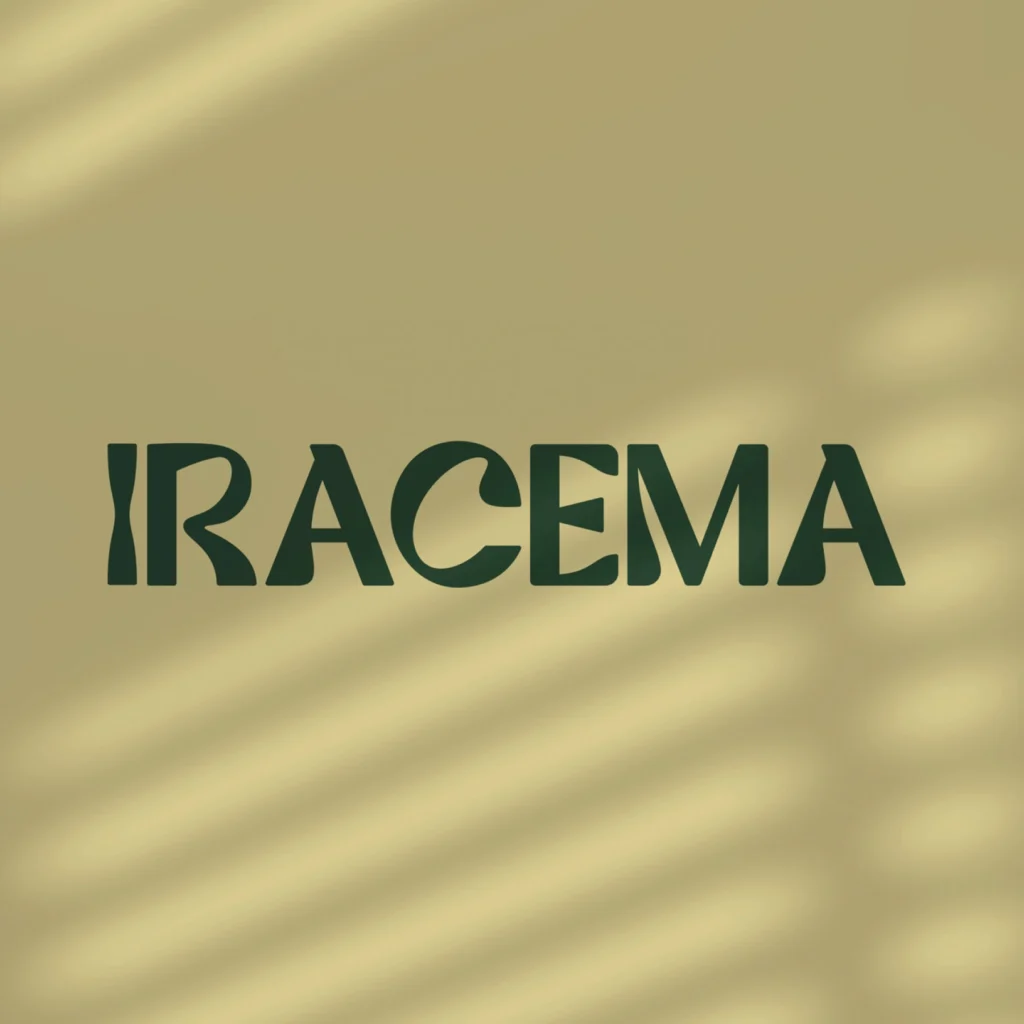
Iracema is an organization dedicated to providing support to individuals facing physical and mental vulnerability, offering medicinal cannabis treatments to improve health and quality of life. The company offers high-quality products, including natural CBD oil, natural THC oil, cannabis flowers, and rosin, alongside personalized treatment and specialized guidance.
Iracema’s distinguishing features encompass an innovative approach, a commitment to patient empowerment, authenticity, transparency in relationships, and social and environmental responsibility. The brand is devoted to crafting an authentic and robust image, conveying its values, and forging emotional connections with consumers.
DoDog

Dodog specializes in canine well-being and care, offering a range of services including daycare, veterinary care, and training. Their mission is to strengthen the bond between dogs and their owners by providing a safe and loving environment for all canines. The company embraces a care-centric and inspirational approach, committed to promoting the well-being and happiness of animals.
To create a friendly and energetic brand, the development of communication materials that align with established principles, strategies, and concepts was essential. Typography was designed to incorporate movement and fluidity, featuring memorable details in its design, resulting in a light, fun, and colorful visual identity.
Hola Rio
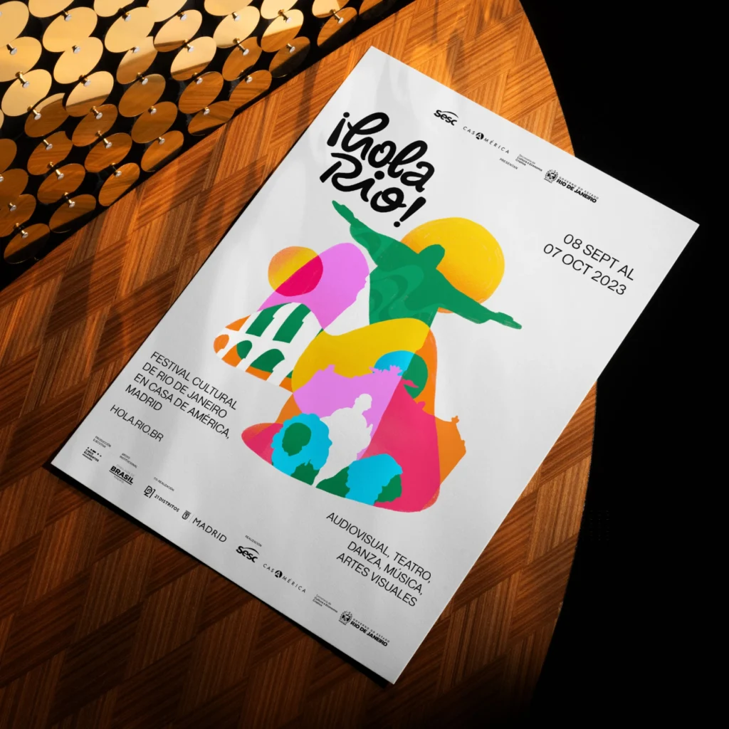
The ¡Hola Rio! Festival is an event that promotes artistic and cultural integration between Brazil and Spain, celebrating the diversity of arts and culture. From September 8th to October 7th, the festival facilitated a rewarding encounter between the state of Rio de Janeiro and the city of Madrid, bringing together Brazilian artists, managers, producers, and technicians in artistic performances, including theater, dance, music, visual arts, and cinema.
The challenge was to create a visual identity that represented the artistic union and cultural richness of both nations, conveying the artistic diversity present at the festival. The solution was a vibrant and dynamic visual identity, using bright colors and dynamic shapes to capture the essence of the event and attract interest, resulting in significant participation from artists and industry professionals.
Florar

The visual identity of Florar was created to reflect its mission of providing support and guidance on the medicinal use of cannabis. Inspired by natural elements, the brand uses organic shapes and soft colors to convey warmth, safety, and well-being. The logo, featuring welcoming hands surrounding a nature-inspired symbol, reflects the association’s human and professional approach, emphasizing its commitment to care and support principles. The green and orange color palette, combined with modern and approachable typography, reinforces the message of health, accessibility, and trust
Festival Elos 2021
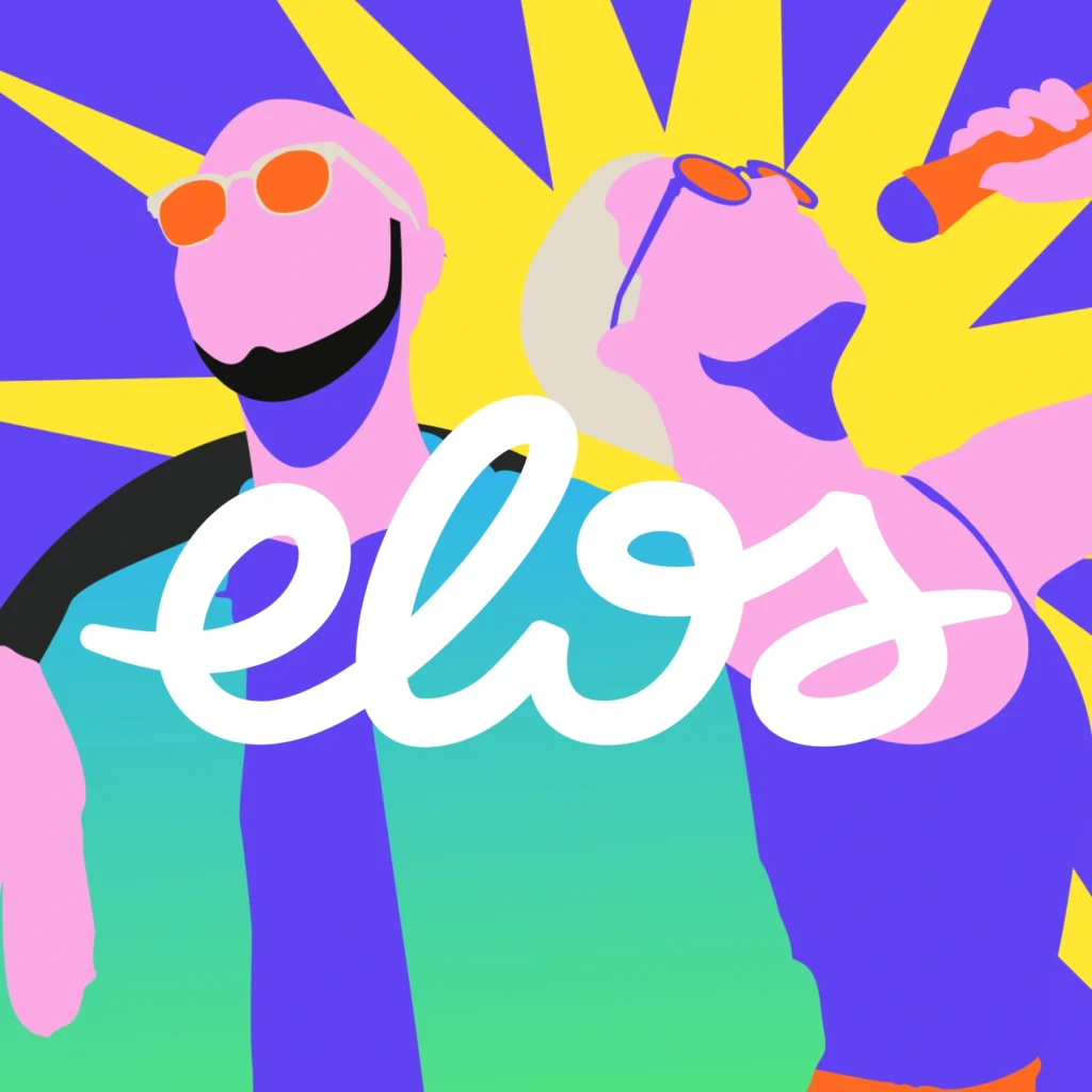
The visual identity of the Elos Festival 2021 was designed to reflect the diversity and vibrant energy of a unique event that blends culture, sports, and social innovation. With a dynamic color palette and graphic elements that evoke movement and connection, the design captures the festival’s inclusive and transformative spirit. The fluid logo and friendly typography reinforce the idea of bonds and unity, while the visual compositions foster a dialogue between art and community. This visual identity is an open invitation for everyone to join this celebration of culture, creativity, and social impact, occupying city spaces with engagement and transformation actions
BetZilla
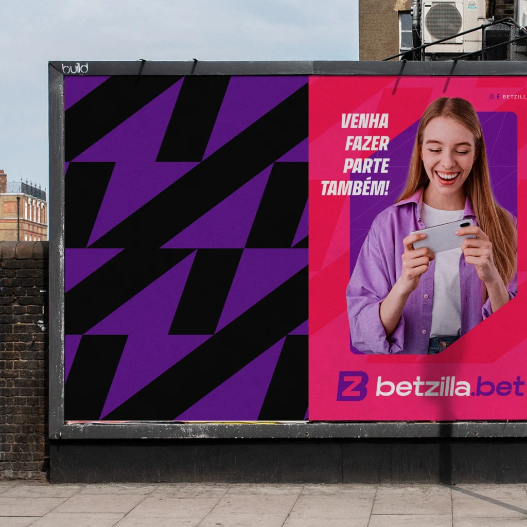
The visual identity of BetZilla was crafted to stand out in the highly competitive sports betting market. Using a vibrant color palette of purple and magenta, the brand conveys sophistication, innovation, and dynamism, aligning with the emotions of its target audience. The modern and bold design, combined with strong typography, reinforces the message of trust, security, and accessibility, reflecting BetZilla’s mission to provide an exciting and secure betting experience for all its users.